Between 1997 and 2003, the future didn’t look soft, friendly, or organic. It looked silver, aggressive, hyper-digital, and slightly dangerous. Screens glowed green, interfaces felt industrial, and the internet wasn’t cozy—it was electric. This brief but intense period gave birth to what we now call Y2K Futurism, a design and cultural aesthetic shaped by rapid technological acceleration, the looming fear of the millennium bug, and a collective obsession with what the next century would bring.
Unlike Frutiger Aero—which later softened technology with sky gradients, bubbles, and eco-optimism—Y2K Futurism was sharp-edged and unapologetically cyber. It reflected a world where machines felt powerful, data felt abstract, and the digital frontier was still unknown. This was the era of translucent plastics, chrome typography, wireframe interfaces, cybernetic fashion, and films like The Matrix redefining how we visualized reality itself.
Today, Y2K Futurism is back—not as nostalgia alone, but as a reference point for modern tech aesthetics, fashion, UI design, music visuals, and AI-era branding. This guide breaks down the origins, philosophy, visual language, and lasting influence of Y2K Futurism, with a deep dive into Cybercore, Chrometype, and the cultural shockwave created by The Matrix.
What Is Y2K Futurism?
Y2K Futurism is an aesthetic and cultural mindset rooted in the late 1990s and early 2000s, shaped by:
- Rapid consumer adoption of computers and the internet
- The dot-com boom and bust
- Fear and fascination surrounding the year 2000
- Early digital interfaces and hardware design
- A belief that technology would fundamentally reshape humanity
At its core, Y2K Futurism imagined the future as machine-dominated, data-driven, and visually metallic. It embraced artificiality rather than hiding it. Circuits were visible. Interfaces looked technical. Fonts felt engineered. Materials looked synthetic.
This was not the warm future. This was the terminal future.
The Millennium Bug and the Psychology of the Era
To understand Y2K Futurism, you have to understand the emotional climate of the late 1990s.
The Y2K Bug as Cultural Anxiety
The “millennium bug” wasn’t just a technical concern—it was a mass psychological event. News headlines warned of global system failures. Governments issued preparedness guides. Pop culture absorbed the anxiety and reframed it visually.
Technology suddenly felt fragile and powerful at the same time. If code could break the world, then code must be respected—and feared.
This tension directly influenced Y2K Futurism:
- Interfaces looked serious, not playful
- Design emphasized control panels and dashboards
- Visuals suggested complexity and hidden systems
The aesthetic mirrored a world holding its breath.
Core Characteristics of Y2K Futurism
Y2K Futurism has a distinct visual and conceptual language. While it overlaps with cyberpunk, it is more corporate, consumer-facing, and optimistic about technology’s dominance.
1. Chrome and Metallic Surfaces
Silver was the color of the future.
- Chrome buttons
- Metallic gradients
- Reflective textures
These surfaces suggested precision, sterility, and technological superiority. Unlike later flat design, Y2K Futurism loved depth and shine.
2. Translucent and Clear Plastics
Inspired by products like Apple’s iMac G3, translucent materials became symbols of honesty and futurism.
- You could see the machine’s insides
- Technology became visually accessible
- Hardware felt less mysterious but more engineered
3. Aggressive Typography (Chrometype)
Fonts weren’t meant to disappear into the background. They were bold, sharp, and often distorted.
- Extended letterforms
- Condensed, techno-inspired fonts
- Chrome, bevels, and glow effects
Typography felt like hardware.
4. Wireframes and Grids
Interfaces borrowed heavily from engineering software and 3D modeling tools.
- Vector grids
- Wireframe objects
- Floating UI elements
The digital world was portrayed as spatial and architectural.
Cybercore: The Heart of Y2K Futurism
Cybercore is the most intense expression of Y2K Futurism. It strips away playfulness and leans fully into machine logic, surveillance, and synthetic identity.
What Defines Cybercore?
Cybercore aesthetics include:
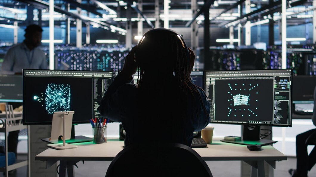
- Dark interfaces with neon highlights
- Green, blue, and red digital glows
- Binary, code, and data overlays
- Industrial textures and cybernetic motifs
Cybercore doesn’t ask whether technology is good or bad—it assumes it’s inevitable.
Cybercore vs Cyberpunk
While often confused, Cybercore differs from cyberpunk in key ways:
- Cyberpunk is anti-establishment; Cybercore is corporate
- Cyberpunk critiques power; Cybercore aestheticizes it
- Cyberpunk is narrative-driven; Cybercore is interface-driven
Cybercore feels like being inside the system, not rebelling against it.
Chrometype: When Fonts Became Machines
Chrometype is one of the most recognizable elements of Y2K Futurism. It refers to the use of metallic, reflective, and engineered typography that dominated branding, UI, and entertainment visuals at the turn of the millennium.
Why Chrome?
Chrome symbolized:
- Precision manufacturing
- High-end machinery
- A future free of organic imperfections
Letters looked forged rather than written.
Where Chrometype Appeared
- Movie posters (The Matrix, Minority Report)
- Video game logos
- Music album covers
- Early tech websites
- Consumer electronics branding
Chrometype communicated authority, modernity, and technical prowess.
The Matrix: The Cultural Blueprint of Y2K Futurism
Released in 1999, The Matrix didn’t just reflect Y2K Futurism—it defined it.
Visual Impact
The film introduced a visual language that became synonymous with the era:
- Green terminal code
- Black leather and vinyl fashion
- Industrial architecture
- Hyper-clean, minimal environments
It fused philosophy, hacking culture, and martial arts into a sleek cyber aesthetic.
Philosophical Alignment
The Matrix resonated deeply with Y2K-era fears:
- Is reality digital?
- Can systems control humanity?
- Is freedom possible inside code?
These themes mirrored real-world anxieties about technology’s growing power.
Influence Beyond Film
After The Matrix:
- Websites adopted dark UI themes
- Fashion leaned into cyber materials
- Music visuals turned industrial and digital
The aesthetic spilled everywhere.
Y2K Futurism in Fashion
Fashion during the Y2K era reflected the same obsessions as tech design.
Materials and Silhouettes
- PVC, vinyl, latex
- Metallic fabrics
- Reflective surfaces
- Futuristic cuts
Clothing looked synthetic on purpose.
Techwear Origins
Modern techwear traces directly back to Y2K Futurism:
- Utility-focused design
- Modular elements
- Functional aesthetics
What started as futuristic fantasy is now practical fashion.
Y2K Futurism vs Frutiger Aero: A Clear Distinction
It’s important to separate Y2K Futurism from Frutiger Aero, which emerged slightly later.
Y2K Futurism
- Aggressive
- Metallic
- Cybernetic
- Machine-forward
Frutiger Aero
- Soft
- Organic
- Nature-inspired
- Human-friendly
Y2K Futurism didn’t try to make technology comforting—it made it powerful.
Digital Interfaces and UI Design in the Y2K Era
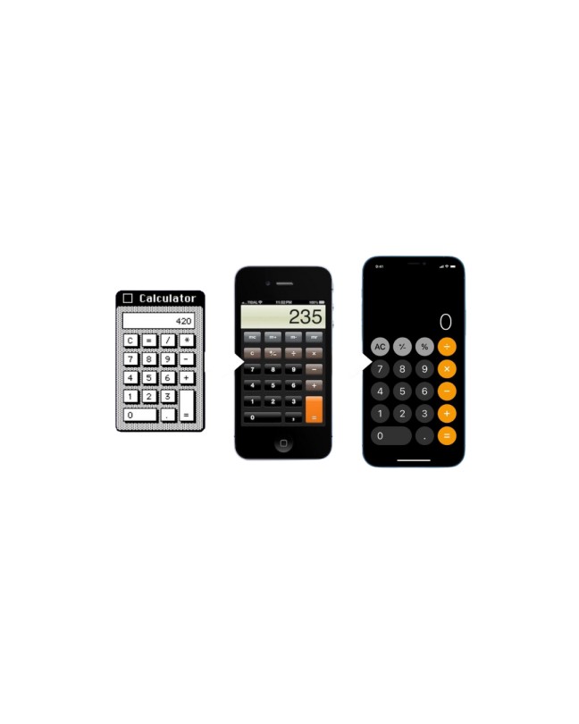
Early operating systems and software reflected Y2K Futurism heavily.
- Beveled buttons
- Drop shadows
- Glossy UI elements
- Animated transitions
Designers wanted interfaces to feel tactile and dimensional, as if you were interacting with a machine rather than a screen.
Music, Media, and the Y2K Futurist Sound
Electronic music genres exploded alongside Y2K Futurism.
- Industrial
- Techno
- Trance
- Early EDM
Album art, stage visuals, and music videos leaned heavily into cyber aesthetics.
Why Y2K Futurism Is Returning Now
The resurgence of Y2K Futurism isn’t accidental.
1. AI and Automation Anxiety
Just like the millennium bug era, we’re once again facing a technological unknown.
2. Digital Fatigue
Flat, minimal design feels emotionally empty. Chrome and texture feel expressive again.
3. Fashion and Internet Culture
TikTok, Instagram, and Gen Z fashion have revived cyber aesthetics.
How Modern Brands Use Y2K Futurism
Today’s brands are selectively borrowing from the era:
- Chrome typography for product launches
- Cybercore visuals in AI branding
- Retro-futuristic UI experiments
The goal isn’t nostalgia—it’s authority and futurism.
Y2K Futurism in the Age of AI
AI interfaces, generative art, and digital identities align naturally with Y2K Futurism.
- Non-human intelligence
- Abstract data visualization
- Synthetic creativity
The future once imagined is now being built.
Designing With Y2K Futurism Today
To use Y2K Futurism effectively:
- Balance chrome with restraint
- Avoid parody
- Focus on function + form
- Reference, don’t replicate
Authenticity matters.
Common Misconceptions About Y2K Futurism
- It’s not just “early 2000s nostalgia”
- It’s not the same as cyberpunk
- It’s not kitsch when done thoughtfully
It’s a serious design language rooted in cultural transition.
The Legacy of Y2K Futurism
Y2K Futurism represents a moment when humanity stood at the edge of a new century, unsure whether technology would save us or dominate us. That uncertainty shaped an aesthetic that was bold, metallic, and unapologetically artificial.
As we once again face massive technological shifts, the return of Y2K Futurism feels less like nostalgia and more like recognition.
We’ve been here before.
Final Thoughts
Y2K Futurism is not just a style—it’s a historical record of how society imagined the future at the turn of the millennium. Through Cybercore, Chrometype, and cultural milestones like The Matrix, it captured the excitement, fear, and ambition of a world stepping into digital dominance.
In an era defined by AI, automation, and virtual identity, revisiting Y2K Futurism helps us understand not just where design came from—but where it might be headed next.


