Picture this: It’s the early 1980s. You’re standing in the electronics aisle, fluorescent lights buzzing overhead. Before you are rows of Atari 2600 game boxes. You pick one up. The artwork is wild, abstract, maybe a spaceship blasting geometric shapes, rendered in bold, painterly strokes. Over the decades, video game box art evolved from simple, imaginative sketches to detailed, visually stunning masterpieces.
It hints at adventure, at worlds unknown, but tells you almost nothing concrete about the flickering, blocky pixels you’ll soon control on your TV screen. That part? That’s up to your imagination, sparked by this enigmatic cardboard gateway. You are there, at the dawn of video game box art.
The Genesis Era: Sparking Imagination (Late 1970s – Early 1980s)
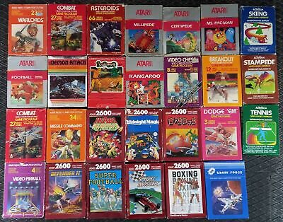
In the beginning, the disconnect between box art and gameplay was vast. The Atari 2600, Intellivision, and their contemporaries rendered worlds in simple blocks and rudimentary sprites. Hardware limitations meant graphics couldn’t convey complex scenes or detailed characters. Box art had a crucial job: bridge the gap between primitive pixels and the player’s imagination.
Artists like Cliff Spohn, Susan Jaekel, and Steve Hendricks at Atari created evocative, often dramatic paintings. Sometimes abstract (like Yars’ Revenge), sometimes more literal but still highly stylized (like Adventure‘s dragon), the goal was to convey a feeling, a sense of excitement and wonder, that the graphics alone could not. The art needed to sell the concept of the game, relying on the player to fill in the visual blanks.
Art Spotlight: Atari’s Adventure (1980)
The box depicts a dramatic scene: a knight-like figure facing a fierce, roaring dragon before a castle. The in-game reality? Your avatar is a simple square, the dragons look like pixelated ducks, and the castles are basic outlines. The box art provides the narrative context and grandeur the hardware couldn’t render.
Parallel Developments
This era’s art drew inspiration from sci-fi and fantasy book covers (think Frank Frazetta or Michael Whelan) and the vibrant artwork adorning arcade cabinets, which also needed to lure players in with visual promises exceeding the screen’s capabilities. Movie posters using traditional illustration were also influential.
User Experience Snapshot
Picking up an Atari box was an act of interpretation. You’d study the art, read the brief text on the back, and try to piece together what the game might actually be. The box was less a depiction and more a Rorschach test for your gaming desires. Do you remember tilting a box, trying to decipher the connection between the art and the minimal screenshots (if any)?
The Breakthrough Years: Characters Emerge (Mid-1980s – Early 1990s)
The arrival of the Nintendo Entertainment System (NES) and Sega Master System changed the game. Technology advanced, allowing for more detailed sprites, recognizable characters, and clearer gameplay mechanics. Box art began to shift accordingly. While still often more elaborate than the 8-bit graphics, the connection became stronger.
This era saw the rise of the mascot. Mario, Link, Samus Aran, Mega Man, Sonic the Hedgehog – these characters became brand ambassadors, and their faces (or helmets) adorned game boxes, creating instant recognition. Art styles often leaned towards cartoonish action, reflecting the games’ content.
However, this period also highlighted a growing divergence: Western box art often differed drastically from the original Japanese versions, sometimes infamously so (the bizarre, oddly-proportioned man on the US Mega Man box vs. the sleek anime character on the Japanese Rockman cover is legendary). Publishers often believed Western audiences needed different, sometimes “grittier” or more “realistic” (by 80s standards) art.
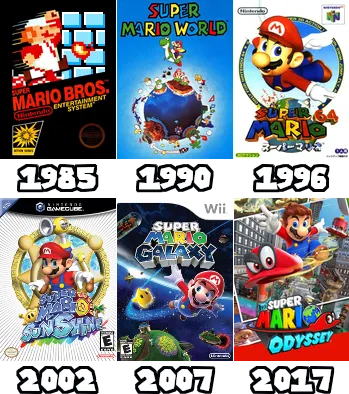
Art Spotlight: Super Mario Bros. (NES, 1985)
Simple, iconic, and effective. Mario bursts through bricks against a yellow background. It clearly communicates action, the main character, and the game’s whimsical nature, even if the art is far simpler than later entries. It established branding through character.
Milestone Markers
- Character Focus: Mascots become central to box art identity.
- Genre Cues: Art starts reflecting game genres more clearly (e.g., fantasy RPGs vs. platformers).
- East/West Divide: Noticeable differences in art style and character depiction between regions emerge.
- Early Branding: Consistent logos and character designs begin building franchise recognition.
User Experience Snapshot
Walking into a store, you could now often recognize the character on the box. The art gave you a better, though still imperfect, sense of the game’s world and tone. You might still encounter the “What were they thinking?” feeling with some Westernized covers, but the ambiguity of the Atari era was lessening.
The Refinement Period: The Rise of CGI and Cinematic Flair (Mid-1990s – Early 2000s)
The 32-bit and 64-bit eras (PlayStation, N64, Saturn) and the subsequent generation (PS2, Dreamcast, Xbox, GameCube) brought polygons and the dawn of 3D gaming. This technological leap profoundly impacted box art. Pre-rendered CGI imagery became a popular choice, allowing covers to depict characters and scenes with unprecedented detail and realism, often closely mirroring the (aspirational) look of the game.
Art styles diversified. While cartoony characters still thrived (Crash Bandicoot, Spyro), many covers adopted a more cinematic approach, especially for mature titles. Moody lighting, dramatic poses, and detailed backgrounds became common. Artists like Yoji Shinkawa (Metal Gear Solid) brought distinct, painterly-yet-modern aesthetics to the forefront.
Box art also became more standardized, with console branding, publisher logos, and content rating symbols (like the ESRB’s) occupying designated spaces, creating a more uniform shelf presence.
Art Spotlight: Metal Gear Solid (PlayStation, 1998)
Yoji Shinkawa’s art, often using brush strokes and stark contrasts, gave the series a unique, sophisticated visual identity that stood out from typical CGI or cartoon styles. The cover communicated espionage, tension, and a distinct artistic vision.
Innovation Timeline (Conceptual)
- Early 90s: Detailed 2D illustrations dominate (SNES/Genesis).
- Mid-90s: Emergence of pre-rendered 3D/CGI art (PS1/N64).
- Late 90s/Early 00s: Increased use of dynamic character poses, cinematic lighting, standardized templates (PS2/Xbox/GC).
What We Gained / What We Lost
- Gained: Higher fidelity art, stronger connection to in-game graphics (especially 3D models), more sophisticated branding, clearer genre communication.
- Lost: Some of the wild, interpretive freedom of early art. Increased standardization sometimes led to less unique layouts.
User Experience Snapshot
Boxes now gave a much clearer preview of the game’s visual style and atmosphere. CGI renders of characters looked closer to their in-game counterparts. Picking up a game like Tomb Raider or Final Fantasy VII, the art felt like a direct window into the world, requiring less imaginative heavy lifting.
The Revolution: HD Realism and the Digital Tease (Mid-2000s – Mid-2010s)
High-definition gaming arrived with the Xbox 360, PlayStation 3, and Wii. In-game graphics achieved near-photorealism for the time, and AAA box art followed suit. Hyper-detailed character renders, dramatic lighting, and action poses became the norm, particularly for shooters and action games.
This led to recognizable tropes – the lone protagonist facing away, the gritty soldier staring intensely, the explosion-filled background. While often technically impressive, some found this era’s mainstream art formulaic.
Simultaneously, the rise of digital distribution (Xbox Live Arcade, PSN, Steam) began. While physical copies remained dominant, box art now also had to function as a small digital thumbnail. This period also saw the explosion of indie games, often featuring highly stylized, artistic, or minimalist covers that served as a counterpoint to AAA realism. Think Bioshock‘s art deco-inspired cover or the beautiful simplicity of Journey.
Art Spotlight: Bioshock (Xbox 360/PS3/PC, 2007)
While featuring the common “protagonist holding weapon” setup, the art deco framing, the imposing Big Daddy, and the underwater city backdrop created a unique, atmospheric, and instantly recognizable cover that perfectly captured the game’s aesthetic.
Unexpected Consequences
The focus on hyper-realism sometimes led to covers feeling generic within genres (e.g., countless similar-looking military shooter boxes). The need for art to work as a tiny thumbnail also began influencing design choices towards bold, simple compositions.
Industry Voice
Designers often spoke about the challenge of creating art that was both epic on a physical box and instantly readable as a 100×100 pixel icon on a digital store.
User Experience Snapshot
Shelf appeal was still king, but you were increasingly likely to see the box art first online. The art was highly representative of the game’s graphical fidelity, especially for big-budget titles. Collector’s Editions with premium packaging began to proliferate, emphasizing the box as a desirable object. Do you remember scrolling through XBLA and noticing how different indie art looked?
The Modern Landscape: Digital First, Physical Artistry (Mid-2010s – Present)
Today, digital sales often surpass physical, making the thumbnail arguably the most important version of a game’s “box art.” Designs must be instantly compelling at small sizes. Yet, paradoxically, physical media has embraced artistry more than ever. Collector’s editions, steelbooks with unique finishes, and reversible covers offering alternate artwork cater to fans who value the tangible object.
AAA art still often leans towards cinematic realism (The Last of Us Part II, Cyberpunk 2077), but there’s also a greater appreciation for more painterly or stylized approaches (The Legend of Zelda: Breath of the Wild, Elden Ring). Indie games continue to be a playground for diverse artistic expression, from pixel art throwbacks to stunning graphic design (Hades, Ori and the Blind Forest). Nostalgia also plays a role, with some modern games deliberately emulating the box art styles of past eras.
Art Spotlight: The Legend of Zelda: Breath of the Wild (Switch/Wii U, 2017)
Link stands atop a cliff, gazing out at the vast, painterly landscape of Hyrule. It evokes adventure, scale, and beauty, perfectly capturing the game’s open-world spirit and distinct visual style, moving away from pure realism towards evocative illustration.
Price Point Perspective
While game prices have increased, the value placed on premium physical editions with elaborate box art, steelbooks, and art books shows a willingness among collectors to pay extra for packaging as art.
Heritage Impact
Modern box art, even digital thumbnails, carries the legacy of its predecessors. It must still grab attention, convey genre and mood, and establish identity. The techniques have changed, but the fundamental purpose remains – to be the game’s first handshake with the player.
Full Circle Reflections
From the abstract paintings of the Atari era that demanded imagination, we’ve journeyed through character-driven branding, the rise of CGI, hyper-realistic HD tropes, and landed in an age where digital thumbnails coexist with lavish physical collector’s items. Early box art needed to compensate for simple graphics; modern physical box art often serves as a collectible artifact celebrating the game’s world, even when the game itself lives on a hard drive.
The core challenge remains surprisingly similar: capture the essence of an interactive experience in a single static image. Whether it’s a blocky pixelated adventure hinted at by a painting, or a sprawling digital world represented by a stunning illustration on a steelbook, box art is the threshold to the game.
The Legacy Continues
Video game box art is more than just packaging; it’s a visual history of the medium, reflecting technological advancements, artistic trends, marketing strategies, and cultural shifts. It’s nostalgia fuel for older gamers and the first point of contact for new ones. Even in a digital-first world, the art endures.
FAQ: Unpacking Box Art History
- Why was early Atari box art so abstract or different from the game?
Hardware limitations meant Atari 2600 graphics were extremely simple. The box art needed to be evocative and imaginative to sell the idea or feeling of the game, as it couldn’t accurately depict the blocky visuals. - Why is Japanese video game box art often different from Western versions?
Historically, publishers believed different markets required different aesthetics. Japanese art often stayed closer to anime/manga styles, while Western marketers sometimes opted for styles perceived as more realistic, “gritty,” or appealing to Western tastes (with sometimes awkward results). - Does box art still matter in the digital age? Yes, absolutely. While physical boxes are less prevalent, the “box art” exists as the game’s thumbnail/icon on digital storefronts (Steam, PS Store, eShop). This small image is crucial for grabbing attention and conveying genre/style in a crowded marketplace. Furthermore, high-quality physical editions with appealing art cater to collectors.
- Who are some famous or influential video game box artists?
Early pioneers include Atari artists like Cliff Spohn. Later influential figures include Yoji Shinkawa (Metal Gear Solid), Akihiko Yoshida (Final Fantasy Tactics, Nier), Greg Martin (Sonic the Hedgehog covers), Drew Struzan (famous movie poster artist who did some game covers), and countless talented studio artists. - What makes “good” video game box art?
Good box art is subjective but generally should: grab attention, clearly communicate the game’s title and branding, hint at the genre and tone, be visually appealing, and ideally, be memorable and iconic. In the modern era, it also needs to work effectively as a small digital thumbnail.