In an era dominated by flat logos, neutral color palettes, and algorithm-friendly minimalism, a surprising visual language from the mid-2000s has surged back into collective consciousness. Across TikTok, Tumblr revivals, design forums, and niche Discord servers, a once-dismissed interface aesthetic is being reexamined, romanticized, and re-created: Frutiger Aero.
Once synonymous with Windows Vista, early smartphone interfaces, and optimistic tech marketing, Frutiger Aero is no longer just a relic of 2000s UI design. It has become a full-fledged cultural aesthetic — one that Gen Z is actively decoding, remixing, and defending. This resurgence is not random nostalgia. It represents a deeper reaction against the emotional flatness of contemporary digital environments and a longing for an internet that once promised harmony between technology, humanity, and nature.
This article offers a definitive, historically grounded explanation of Frutiger Aero, tracing its origins, visual language, sub-genres, cultural meaning, and why — in 2026 — it has become the dominant retro-aesthetic of a new generation.
What Is Frutiger Aero? A Definition
Frutiger Aero is the prevailing digital design language that dominated mainstream operating systems, consumer software, and tech marketing between approximately 2004 and 2013. The term is a retrospective label, coined by internet communities years after the aesthetic fell out of favor, combining two core influences:
- Adrian Frutiger’s humanist sans-serif typography (especially fonts like Frutiger, Myriad, Segoe UI)
- Microsoft’s “Aero” user interface, introduced with Windows Vista
Unlike named movements such as Bauhaus or Swiss Modernism, Frutiger Aero was never formally declared. It emerged organically across industries — from operating systems and phone interfaces to car dashboards, eco-tech advertisements, and educational software.
At its core, Frutiger Aero reflects a belief system:
Technology should feel friendly, optimistic, tactile, and environmentally integrated.
Frutiger Aero vs. Y2K: A Crucial Distinction
Frutiger Aero is often confused with the Y2K aesthetic, but the two represent fundamentally different visions of the future.
Y2K Aesthetic (Late 1990s – Early 2000s)
- Chrome textures, metallic surfaces
- Cyber-futurism and sci-fi abstraction
- Alien, experimental typography
- Anxiety about the digital unknown
- Technology as something other
Frutiger Aero (2004–2013)
- Glossy glass, water, grass, sky
- Humanist sans-serif typography
- Skeuomorphism and realism
- Optimism and clarity
- Technology as friendly and natural
If Y2K imagined the future as cold and hyper-mechanical, Frutiger Aero imagined a utopian eco-future, where digital systems felt intuitive, breathable, and emotionally reassuring.
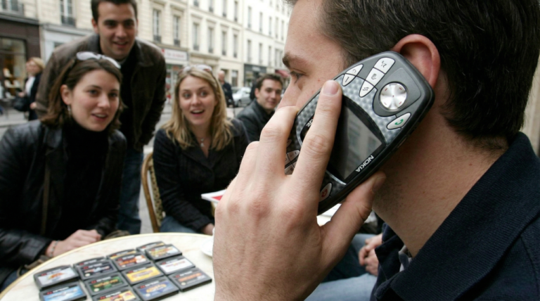
The Historical Moment That Gave Birth to Frutiger Aero
To understand Frutiger Aero, we must understand the cultural context of the early to mid-2000s.
This was a transitional era:
- The internet was becoming mainstream but still felt hopeful
- Smartphones were emerging, not yet addictive
- Climate awareness was rising but not yet catastrophic
- Technology was marketed as a tool for connection, not extraction
Post-9/11 anxieties, combined with rapid technological advancement, created a desire for interfaces that felt calm, clean, and reassuring. Design responded accordingly.
Rather than overwhelming users with abstraction, designers leaned into:
- Familiar physical metaphors
- Organic shapes
- Soft lighting
- Environmental imagery
This philosophy found its most iconic expression in Windows Vista.
Windows Vista and the Birth of the Aero Interface
Released in 2007, Windows Vista was Microsoft’s most ambitious attempt to redefine personal computing aesthetics. While often criticized for performance issues, Vista’s visual language left an indelible mark on design history.
The Meaning of “Aero”
Microsoft officially defined “Aero” as an acronym:
- Authentic – Interfaces should feel real and tactile
- Energetic – Bright colors and dynamic animations
- Reflective – Glass, translucency, light interaction
- Open – Spacious layouts, airiness, clarity
These principles shaped everything from window borders to icons, wallpapers, and system sounds.
Key Visual Features
- Translucent glass windows
- Soft glow highlights
- Rounded corners
- Subtle animations
- Nature-inspired wallpapers (auroras, skies, landscapes)
Vista didn’t just display information — it performed optimism.
The Role of Typography: Adrian Frutiger’s Influence
Typography is one of the most overlooked yet defining aspects of Frutiger Aero.
Humanist sans-serif fonts — inspired by Adrian Frutiger’s philosophy — dominated this era. These fonts emphasized:
- Legibility across screens
- Open letterforms
- Warm, human proportions
- Neutral but friendly tone
Fonts like Segoe UI, Myriad, Frutiger, and Tahoma were designed to be read effortlessly by humans — not optimized for brand abstraction or algorithmic scalability.
In contrast to today’s ultra-geometric fonts, Frutiger-inspired typography feels empathetic.
Nature as Interface: Grass, Water, and Sky
One of the most defining markers of the Windows Vista aesthetic — and Frutiger Aero as a whole — is its obsessive use of nature imagery.
From Bliss to Auroras
- Windows XP’s “Bliss” wallpaper introduced grassy utopias
- Vista evolved this into abstract skies, light rays, and auroras
- Nature became symbolic, not literal
This visual language suggested:
- Sustainability
- Clean energy
- Balance between technology and environment
Water and Glass
Water droplets, reflections, and transparency symbolized:
- Purity
- Fluidity
- Trust
- Clean digital ecosystems
In retrospect, this imagery represented a hopeful belief that technology would solve environmental problems, not accelerate them.
Skeuomorphism: When Interfaces Felt Real
Frutiger Aero flourished during the golden age of skeuomorphism — the design practice of mimicking real-world materials and objects.
Examples include:
- Buttons that looked pressable
- Icons resembling physical tools
- Sliders with depth and shadows
- Textures like glass, plastic, and metal
This wasn’t just aesthetic indulgence. It was instructional. Early digital natives needed visual cues to understand new technologies. Skeuomorphism acted as a bridge between physical intuition and digital interaction.
Sub-Genres of Frutiger Aero
As online communities began categorizing the aesthetic, several distinct sub-styles emerged.
Frutiger Eco
- Emphasizes green energy
- Wind turbines, leaves, solar panels
- Blue-green color palettes
- Eco-utopian tech branding
Often seen in:
- Sustainability campaigns
- Educational software
- Early smart-city concepts
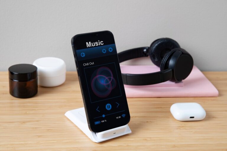
Dark Aero
- Glossy UI on black or dark backgrounds
- Neon highlights
- High contrast reflections
- Popular between 2007–2012
This sub-genre appeared in:
- Media players
- Gaming interfaces
- Automotive dashboards
Medical / Educational Aero
- Clean whites and blues
- Soft gradients
- Clinical but friendly design
- Used in hospitals, schools, and science apps
Each sub-genre reflects a different emotional application of the same design philosophy.
The Fall of Frutiger Aero
By the early 2010s, Frutiger Aero began to disappear.
Why It Was Abandoned
- Rise of mobile-first design
- Performance optimization
- Simplification for smaller screens
- Corporate branding demands
- Cost efficiency
Apple’s shift to flat design in iOS 7 (2013) marked a turning point. Microsoft followed with Windows 8. Skeuomorphism was declared “dead,” replaced by flat, neutral minimalism.
What was lost, however, was emotional texture.
Enter Corporate Minimalism
The 2010s ushered in a design monoculture:
- Flat colors
- Sans-serif logos
- Abstract shapes
- Emotionally neutral interfaces
Often called Corporate Memphis, this style optimized for scalability and branding consistency — not human delight.
For Gen Z, who grew up surrounded by these environments, something felt missing.
Why Frutiger Aero Is Viral in 2026
The Frutiger Aero revival isn’t just nostalgia — it’s resistance.
Gen Z’s Perspective
- Raised on early smartphones and Windows PCs
- First generation to experience the internet before total platformization
- Nostalgic for an era when technology felt playful, not extractive
Cultural Factors Driving the Revival
- Burnout from hyper-minimalism
- Emotional detachment in modern apps
- Desire for sincerity over irony
- Longing for optimistic futures
Frutiger Aero offers an alternative timeline — a reminder that technology once promised beauty and care.
TikTok, Tumblr, and the Aesthetic Archive
Social platforms have become informal museums of digital history.
On TikTok:
- “Frutiger Aero explained” videos
- Windows Vista sound recreations
- UI moodboards
On Tumblr and Reddit:
- Archival screenshots
- Design breakdowns
- Philosophical discussions
The aesthetic is no longer mocked — it’s studied.
Frutiger Aero as an Object of Nostalgia
Design critics increasingly describe Frutiger Aero as an object of nostalgia, not for childhood alone, but for a lost future.
It represents:
- A time before constant surveillance
- Before algorithmic feeds
- Before digital exhaustion
In this sense, the Gen Z nostalgia surrounding Frutiger Aero is not backward-looking — it’s speculative.
Will Frutiger Aero Influence Future Design?
While a full return to skeuomorphism is unlikely, Frutiger Aero’s revival is already shaping trends:
- Soft gradients are returning
- Nature motifs are reappearing
- Depth and translucency are back
- Emotional design is being re-valued
Designers are beginning to ask:
What if interfaces felt hopeful again?
Conclusion: More Than an Aesthetic
Frutiger Aero is not just a visual style — it’s a cultural artifact.
It reflects a moment when humanity believed technology could be:
- Gentle
- Optimistic
- Environmentally harmonious
- Emotionally supportive
Gen Z’s obsession with the Windows Vista aesthetic is not ironic. It is deeply sincere — a longing for digital spaces that felt designed for people, not metrics.
As the internet continues to fragment and commodify attention, the Frutiger Aero renaissance stands as a reminder that another digital future was once imaginable — and perhaps still is.