For over a decade, flat design reigned supreme. Clean lines, muted palettes, and minimal ornamentation became the default language of digital interfaces. But in 2026, a quiet rebellion is underway. Designers, users, and platform leaders are once again embracing depth, texture, and tactility. Skeuomorphism 2026 is not a nostalgic regression—it’s a deliberate response to emotional and cognitive fatigue caused by years of sterile minimalism.
With Apple’s VisionOS introducing layered spatial interfaces and “Liquid Glass” effects, and UI trends across apps hinting at softness, realism, and material presence, the debate of flat design vs skeuomorphic design has resurfaced with renewed urgency. This shift reflects a deeper desire: users want digital experiences that feel human again.
This article explores why skeuomorphism is returning, how it evolved, why flat design dominated for so long, and what this new era—often called Neo-Skeuomorphism or Soft UI—means for the future of interface design.
Understanding Skeuomorphism: More Than Just Decoration
Before discussing its return, it’s essential to understand what skeuomorphism actually is—and what it was never meant to be.
What Is Skeuomorphism?
Skeuomorphism is a design approach where digital elements visually resemble their real-world counterparts. This can include:
- Textures (leather, paper, wood, metal)
- Physical metaphors (buttons, switches, knobs)
- Visual cues that mimic real objects
The key purpose was affordance—a concept in design psychology that refers to how an object suggests its own use.
The Original Functional Purpose
Early digital interfaces were unfamiliar and intimidating. Skeuomorphism helped users bridge the gap between physical and digital worlds. When:
- A notes app looked like a legal pad
- A calendar resembled a stitched leather planner
- A music player mimicked a CD deck
Users intuitively understood what actions were possible—without instruction.
This functional clarity was especially critical during the early smartphone era, when touchscreen interactions were still new.
Apple Design History: The Golden Age of Skeuomorphism
No company is more closely associated with skeuomorphism than Apple. To understand the current comeback, we must revisit Apple design history during its most decorative era.
iOS 1–6: Texture as Interface Language
Between 2007 and 2012, Apple’s software design leaned heavily into skeuomorphism:
- The iOS Calendar featured stitched leather
- Notes looked like yellow legal pads
- Contacts resembled a physical address book
- iBooks had wooden bookshelves
- Game Center felt like a casino table
Under Scott Forstall, Apple believed realism made technology approachable. This philosophy aligned with Steve Jobs’ obsession with craftsmanship and physicality—even in software.
Why It Worked Then
At the time:
- Touchscreens were new
- Users needed visual metaphors
- Physical cues reduced cognitive load
- Interfaces felt warm and personal
Skeuomorphism wasn’t kitsch—it was educational.
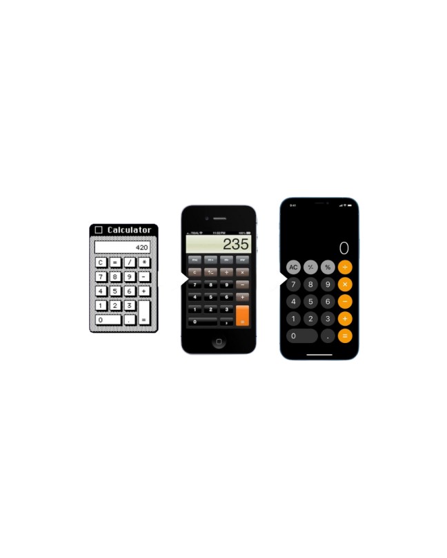
The Flat Revolution: iOS 7 and the Minimalist Takeover
Everything changed in 2013.
iOS 7: The Great Reset
When Jony Ive took over software design, Apple launched iOS 7—a radical departure from skeuomorphism. It introduced:
- Flat colors
- Thin typography
- Minimal iconography
- Translucency instead of texture
This moment defined the flat design vs skeuomorphic debate for the next decade.
Why Flat Design Took Over
Flat design aligned with:
- Faster loading times
- Responsive web needs
- Cross-platform consistency
- Modernist aesthetics
- Scalability across devices
Google’s Material Design, Microsoft’s Metro UI, and countless SaaS tools followed suit. Minimalism became synonymous with professionalism and efficiency.
The Flat Era (2013–2026): Efficiency at a Cost
For over a decade, flat design dominated UI trends. But dominance came with unintended consequences.
The Rise of Interface Homogeneity
By the early 2020s:
- Apps looked interchangeable
- Brand identity weakened
- Interfaces felt emotionally neutral
- Buttons became harder to distinguish
What was once “clean” began to feel cold.
User Fatigue Sets In
Research and anecdotal UX feedback revealed:
- Increased cognitive effort to understand tappable areas
- Reduced sense of delight
- Emotional detachment from interfaces
- A feeling of “digital emptiness”
Minimalism optimized efficiency—but sacrificed sensory engagement.
Why Skeuomorphism Is Returning in 2026
The resurgence of skeuomorphism isn’t accidental. It’s driven by cultural, technological, and psychological shifts.
1. Spatial Computing and VisionOS
Apple’s VisionOS reintroduced:
- Layered depth
- Volumetric UI
- Light, shadow, and translucency
- Real-world spatial metaphors
Flat design simply doesn’t translate well into 3D environments. Depth is no longer optional—it’s necessary.
2. Emotional Design Is Back
Modern UX prioritizes:
- Delight
- Comfort
- Emotional resonance
- Human-centric interaction
Digital textures and soft realism evoke familiarity, warmth, and trust.
3. The Rejection of “Sterile Tech”
Post-pandemic users crave:
- Sensory richness
- Nostalgia
- Imperfection
- Tactile cues in digital spaces
Skeuomorphism answers this emotional need.
Neo-Skeuomorphism: The Modern Twist
The skeuomorphism of 2026 is not a return to stitched leather calendars. Instead, it has evolved.
What Is Neo-Skeuomorphism?
Also known as Soft UI, Neo-Skeuomorphism blends:
- Minimalism
- Soft shadows
- Subtle gradients
- Diffused lighting
- “Liquid Glass” surfaces
It suggests physicality without copying it literally.
Key Characteristics
- Buttons appear gently raised or inset
- Interfaces feel touchable without being busy
- Depth is implied, not illustrated
- Materials feel premium, not cartoonish
This approach balances clarity with emotional depth.
Digital Textures: From Decoration to Sensory Design
In 2026, digital textures are no longer visual noise—they are strategic tools.
Why Texture Matters Again
Texture:
- Signals interactivity
- Improves accessibility
- Reduces ambiguity
- Creates hierarchy
- Enhances brand personality
Used subtly, it improves usability rather than hindering it.
Case Studies: Skeuomorphism in Modern Interfaces
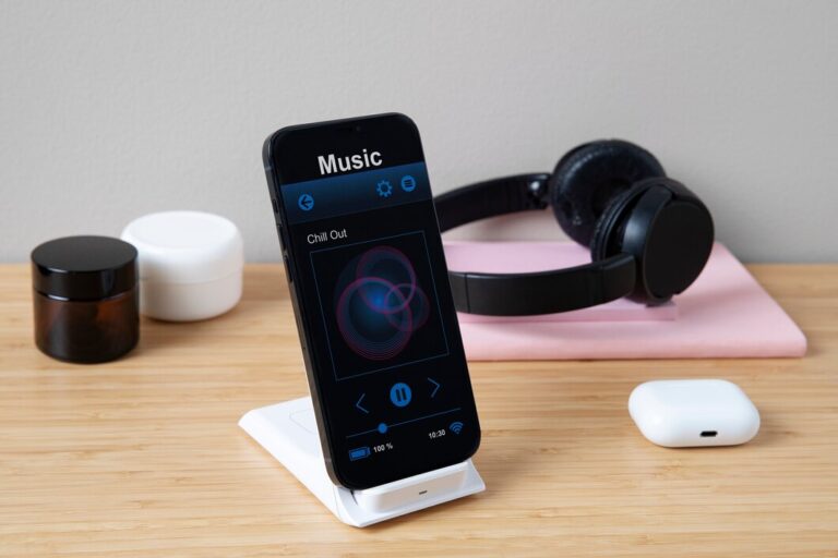
ClearFrame CD Player
Apps like the ClearFrame CD Player exemplify modern skeuomorphic thinking:
- Mimics vintage CD decks
- Uses physical metaphors
- Encourages mindful music listening
- Creates emotional attachment
Users don’t just use the app—they experience it.
Vintage Radio Interfaces
Digital radios and audio apps that mimic analog controls:
- Knobs
- Dials
- LED indicators
These designs create nostalgia-driven engagement without confusing users.
Flat Design vs Skeuomorphic: A False Binary?
The debate is no longer about choosing sides.
The Hybrid Future
Modern UI trends suggest:
- Flat layouts + depth cues
- Minimal structure + tactile feedback
- Efficiency + emotion
Designers are learning that usability and beauty are not opposites.
The Psychology Behind the Skeuomorphic Comeback
Cognitive Ease
Humans process depth and shadows instinctively. Flat interfaces require learned behavior.
Emotional Memory
Textures trigger:
- Nostalgia
- Comfort
- Trust
- Familiarity
This is why skeuomorphism feels “right” again.
Scott Forstall vs Jony Ive: A Philosophical Divide
The return of skeuomorphism also reopens old debates in Apple design history.
- Forstall prioritized familiarity
- Ive prioritized purity
2026 design trends suggest the pendulum is swinging back toward Forstall’s philosophy—refined by modern restraint.
Skeuomorphism as a Luxury Aesthetic
Today, skeuomorphism signals:
- Premium experience
- Attention to detail
- Craftsmanship
- Intentional design
Much like vinyl records or mechanical keyboards, it appeals to users who value feel, not just function.
Implications for UX Designers
When to Use Neo-Skeuomorphism
Best for:
- Wellness apps
- Music and media
- Creative tools
- Spatial interfaces
- Lifestyle products
Avoid in:
- Data-dense dashboards
- High-speed transactional flows
UI Trends Beyond 2026
Looking ahead:
- Interfaces will become more spatial
- Haptics will matter more
- Visual depth will guide interaction
- AI will personalize interface texture and tone
Skeuomorphism will evolve alongside these shifts.
The Cultural Context: Why Now?
The return of skeuomorphism mirrors broader cultural movements:
- Analog revival
- Slow tech
- Digital mindfulness
- Human-centered design
This isn’t about nostalgia—it’s about balance.
Conclusion: The Return of Feeling in Digital Design
Skeuomorphism 2026 is not a rejection of progress—it’s a correction. After years of hyper-minimalism, users want interfaces that feel alive, responsive, and emotionally resonant. The rebellion against flat design is less about style and more about substance.
As UI trends continue to evolve, the future belongs not to extremes, but to thoughtful synthesis. Neo-skeuomorphism represents a mature design philosophy—one that understands that humans don’t interact with screens as abstract grids, but as extensions of their senses.
The flat era taught us efficiency.
The skeuomorphic revival reminds us of humanity.
And in the next chapter of digital design, feeling may matter as much as function.