The first time I died in Castlevania, I wasn’t angry. I was mesmerized. Not by the game play—though that was excellent—but by the text. The words “GAME OVER” appeared in a sharp, serif font that felt ripped from a medieval manuscript. It looked permanent. Important. Like my failure had been carved into stone.
Table of Contents
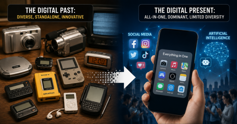
That moment planted a seed. Over the years, I’ve realized that game typography is one of the most overlooked pieces of retro nostalgia. We talk about sprites, chiptunes, and cartridges, but we rarely discuss the fonts that told us we were dead.
So let’s fix that.
The Typographic Golden Age Nobody Talks About
Before TrueType fonts and downloadable assets, game developers drew their letterforms by hand—pixel by pixel—and burned them directly onto ROM chips. Every character was a tiny mosaic, limited by the hardware’s tile size and color palette.
The NES, for example, could only display 256 unique 8×8 tiles at once. That meant the entire alphabet, plus numbers and symbols, had to fit within a minuscule grid. The result? Fonts that were unmistakably game-like. Sharp, angular, and unapologetically pixelated.
I remember the golden serif of The Legend of Zelda’s dialogue boxes. The chunky, industrial letters of Metroid’s “START” screen. The almost Gothic weight of Final Fantasy’s menu text. Each one was a design choice that shaped how the game felt, and each one is etched into my memory as clearly as any boss fight.
Why “YOU DIED” Hits Harder Than You Think
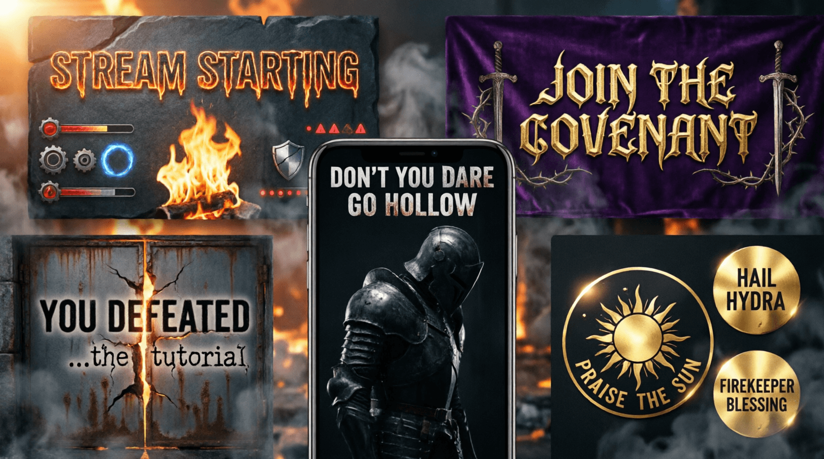
When FromSoftware released Demon’s Souls in 2009, they resurrected that old typographic spirit. The “YOU DIED” screen wasn’t just a game-over message—it was an aesthetic statement. The font was a modernized blackletter, reminiscent of illuminated manuscripts and old religious texts. It transformed dying from a gameplay mechanic into a ritual.
This design choice didn’t come from nowhere. It has deep roots in arcade history, where “INSERT COIN” and “CONTINUE?” were displayed in bold, authoritative fonts designed to command your attention (and your quarters). And earlier, in the medieval fantasy games of the 8‑bit and 16‑bit eras—Ghosts ‘n Goblins, Castlevania, Dragon’s Lair—where gothic and serif fonts reinforced the dark, ancient worlds you were exploring.
The genius of Dark Souls’ typography is that it makes you feel like your death is part of a larger, ancient tragedy. It’s not just “you lost.” It’s “you have fallen, and the world will remember.”
The Analog Soul of Digital Letters
What makes these old game fonts so special? Partly, it’s the technical constraints that forced creativity. Designers couldn’t just download a font file; they had to invent one that worked within the memory limits of a cartridge.
I remember discovering that the iconic Commodore 64 font was actually just 8×8 pixel grids, and that some games would completely replace the system font with custom designs loaded from the game disk. That felt like magic—the idea that a game could change the very language of the machine it ran on.
This analog, hand‑crafted quality gave old game text a warmth and character that modern, smooth UI fonts often lack. It’s why we still get a thrill when we see those jagged, imperfect letters on a screen.
Recreating Retro Game Text in the Modern World
The good news is you don’t need a ROM chip and a hex editor to capture that old‑school typographic magic anymore. Free, browser‑based tools now let you generate retro game text in seconds.
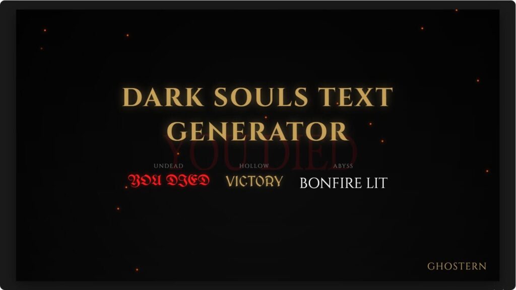
For that specific gothic, medieval weight—the “YOU DIED” aesthetic—a dedicated generator does the heavy lifting. For example, a tool like the Dark Souls Font Generator lets you type any message and instantly download it as a transparent PNG, ready to layer over a screenshot for a thumbnail, a Discord banner, or just a nostalgic lock screen.
The appeal isn’t just about making memes. It’s about keeping a piece of that typographic history alive. When I generate a mock “GAME OVER” screen in a gothic font, I’m not just making an image—I’m reconnecting with the feeling of sitting cross‑legged on the floor, staring up at a CRT television, and reading my fate in glowing phosphor letters.
Why This Matters Now
We’re living in a golden age of pixel art revivals, retro‑style indies, and a general cultural obsession with the 80s and 90s. Typography deserves its seat at the nostalgia table. Next time you fire up an emulator or boot your old NES Classic, take a moment to look at the text. Notice how the font contributes to the atmosphere. And then, if you’re feeling inspired, go make your own.
Because the letters are part of the game, too.